Michael Russell with Fluidity Solutions
September 2024
Digital City Project for an indigenous diaspora of Southern Africa bringing technological modernity and convenience to the people.

Telemedicine has become a far larger part of everyone’s lives following the Covid-19 Pandemic. This was true even in areas where doctors, practices, hospitals, and clinics are abundant. To the point that even if people are able to have an appointment in person they may schedule an online consultation instead. We always also have to consider that sometimes physically going in for a consultation is an absolute privilege and for many people they may not have one in walking distance or nearby at all. This is why in many rural communities tele-health can be such a game changer for people. It provides access to professionals who (somewhat due to the pandemic) are well versed in helping people’s ailments online.
Patient Appointment Scheduling Flow
The goal was to keep things simple, minimalistic and familiar to novice users, many of whom may have never used a tele-health service before. Working in conjunction with senior members of the community we crafted some essential needs for the platform. First and foremost that an ability to search for healthcare professionals appeared at the top, followed by any upcoming appointments, followed by any prescriptions, sick notes or documentation they may need, followed by their personal health records. They also wanted the platform to be educational so healthcare professionals and Admins can add relevant healthcare news and articles, and users can link (applicable) health apps to keep healthy and reward healthy lifestyles.

- As with anything UX, we have to focus on what the crux of this platform is, and that is to easily find and schedule an appointment with a healthcare professional.
- User uses search functionality
- Can type in either the name of a healthcare professional, practice or speciality.
- Search yields results.
- Go to professional’s profile.
- Schedule an appointment.
- Confirmation of Appointment.
- Upcoming appointment appears at the top of the User’s Dashboard.

Search Functionality
- Ability to side scroll and select speciality at the top.
- Visual written Indication of how to use the search bar.
- Results of related Health Professionals
- Legal Credentials Including Full name of healthcare professional, practice number and registration number.
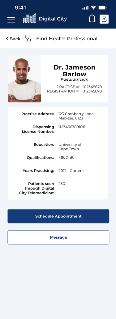
Healthcare Professional Profile
- Shows Practise Address
- Dispensing license (in case a prescription is needed.)
- Education
- Qualifications
- Patients seen (to give user peace of mind that they are a good telehealth professional.
- Messaging access and ability to quickly schedule appointments
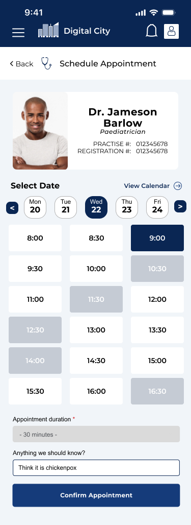


Appointment Scheduling
- Shows Doctors Credentials at the top to give user ease of mind (they know they are in the right place)
- Shows Earliest possible date for appointment and access to a calendar.
- Slide Scroll oir tap for next days schedules.
- Large buttons with good spacing for confirming time slots
- Unavailable time slots greyed out.
- Selected Time Slot Clear and in Blue
- Area for any additional notes for the doctor.
- Clear Blue primary button for confirming appointment slot.
- Clear indication of upcoming appoitment and pathway to payment.
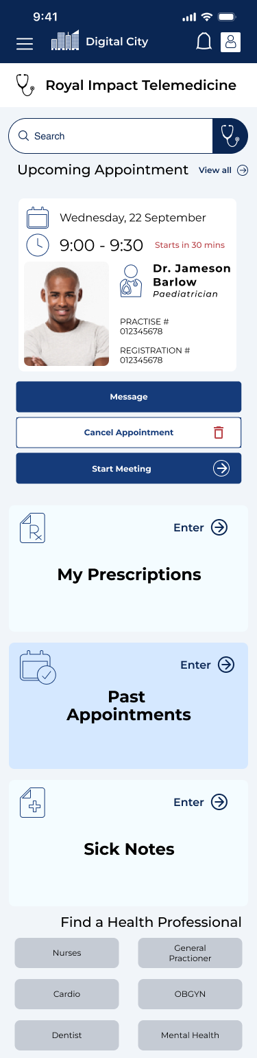
Updated Appointment Dashboard
The scheduled appointment appears at the top of the dashboard once the user has scheduled an appointment to remind them that they have an upcoming appointment. When it is 30 minutes before the appointment the user will be indicated that it is happening soon and the times and date are clearly visible at the top. The stakeholders wanted 3 call to action buttons with a specific orders of colours based on what they believed was the best aesthetic to their eyes so to further differentiate the calls to action I added certain icons such as an arrow to start the meeting and a red bin to cancel the appointment.
The client also desired that the order of all dashboard operations stays the same while the implement their plan for the digital city which makes everything easier to find for novice users which technically are all the users since this is a brand new platform for them. The actual appointment on the user (patient) end is supported by Google Meet and will comply to Telehealth privacy standards.

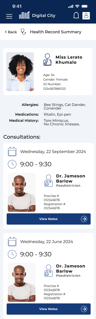
As a whole, for the core users of this platform which are the prospective patients, we focused on the main goal which was to schedule and start a telemedicine appointment. The only medical information that is shared on the platform for the user is who they have seen, their prescriptions (which are accessed via QR Code at the pharmacy), sick notes which are visible for the allotted time that they are valid, and their visits with healthcare professionals through the platform. We made due diligence that the Sick Notes and Prescriptions are legally binding by law, and the sick note can be used across the platform if the user is enrolled in the Digital School Course or a Digital School Programme.
Healthcare Professional Flow
I had to design the flow for the Healthcare Practitioners on the platform too. The main crux of this is that it is easier for Doctors, Nurses, and other healthcare professionals to enter appointments, take notes on the appointments, see past appointments, prescribe medication, and set their availability.
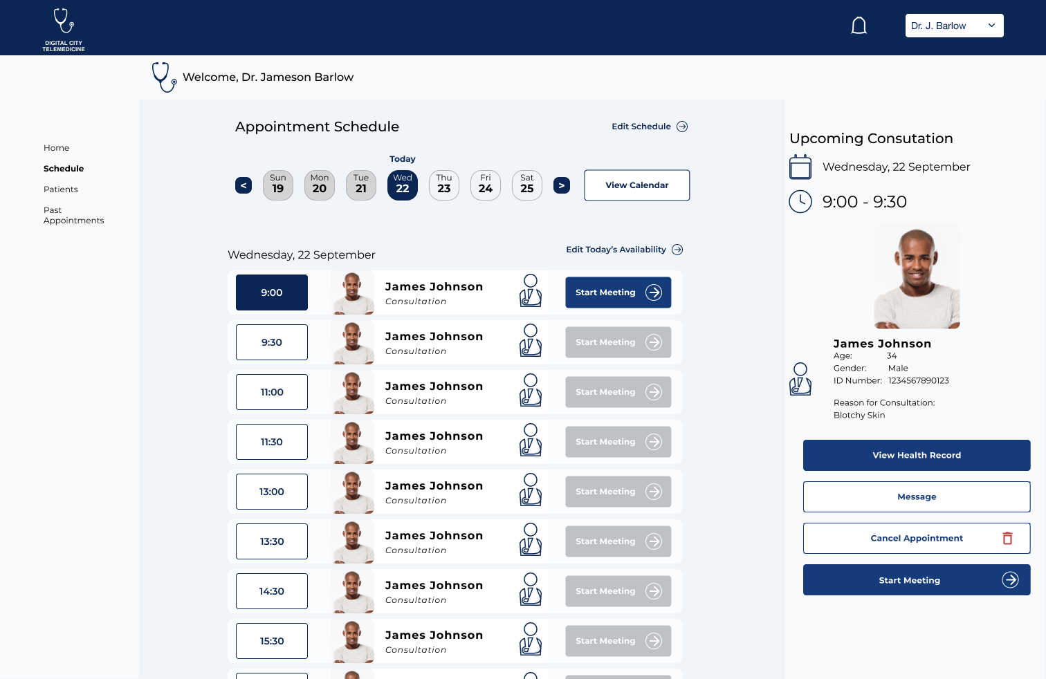
Dashboard
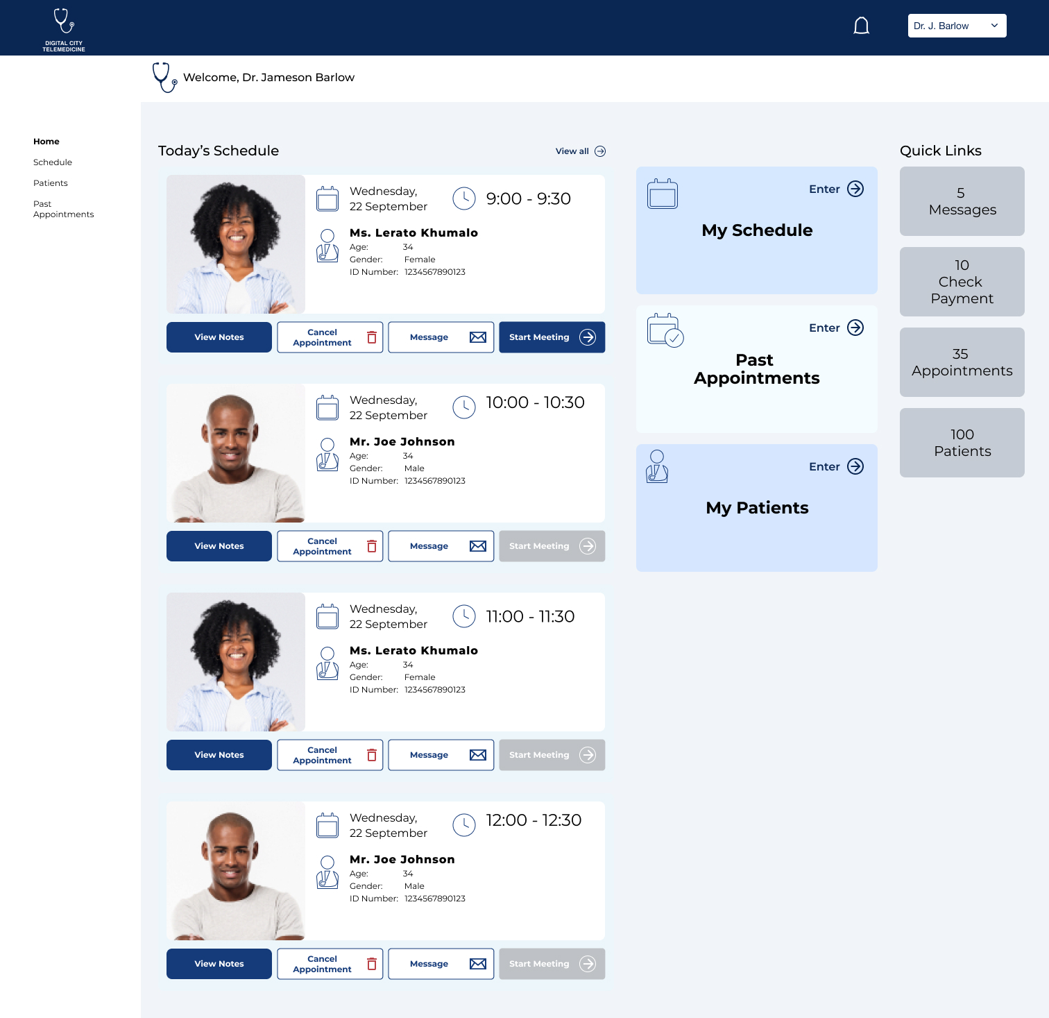
The with the Dashboard here is to keep everything simple. The left hand side has all the upcoming appointments for the day. The right hand side contains portals to set their schedule, view past appointments or search through their patients to view their files.
The components with the upcoming appointments contain links to patient notes (seeing as the patient fills out their ailment if it is their first time otherwise it will show them the patient history. It also gives the options to cancel the appointment and message the patient. The start meeting will only turn blue for their next appointment.
Consultations
Consultations (meetings) start when the doctor selects “Start Meeting” and they are brought through to a private screen through googlemeet. Each screen has an area for notes on the right hand side so the healthcare professional doesn’t have to change windows or tabs.
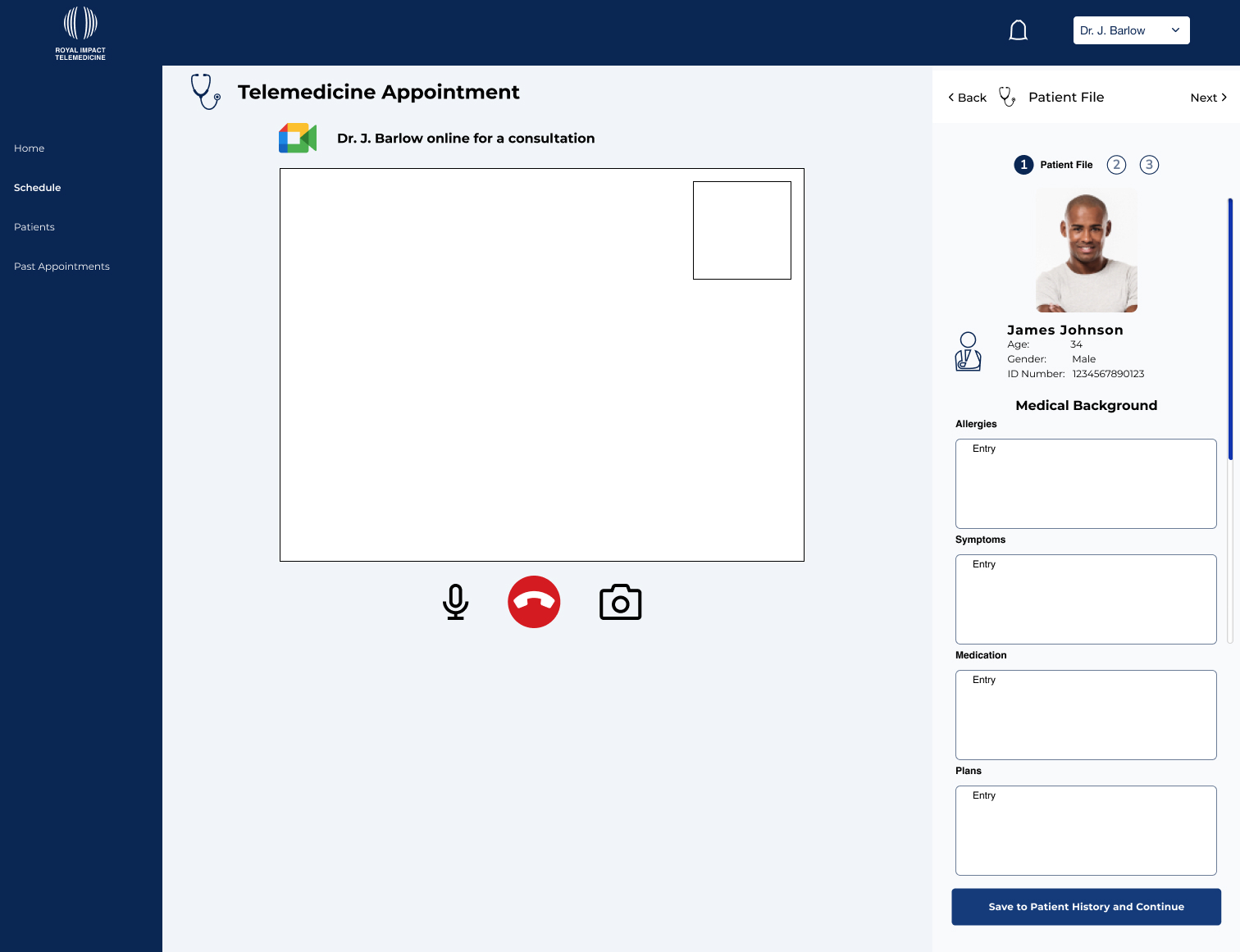
The initial screen contains a view of the telehealth video and 4 areas for the doctor to take notes on the patients ailment. These include potential allergies, symptoms, and medications they may be on and that is followed up by potential plans the doctor writes up to help the patient.
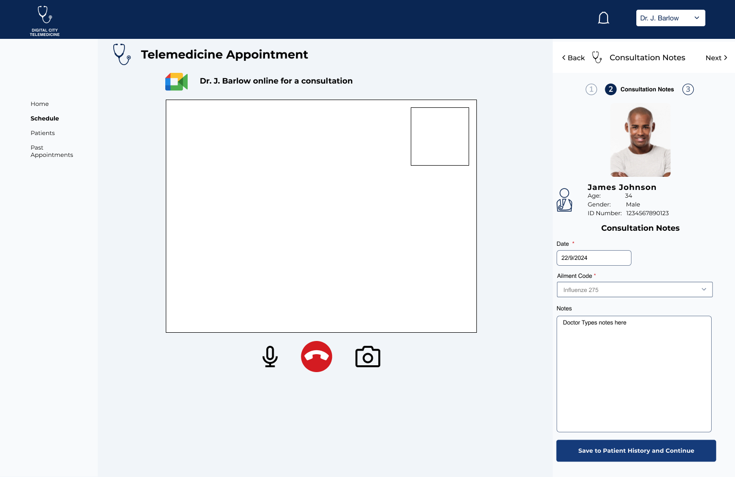
The second screen (right-hand side) contains other notes from the as well as the date and ailment code for tracking the spread of illnesses.
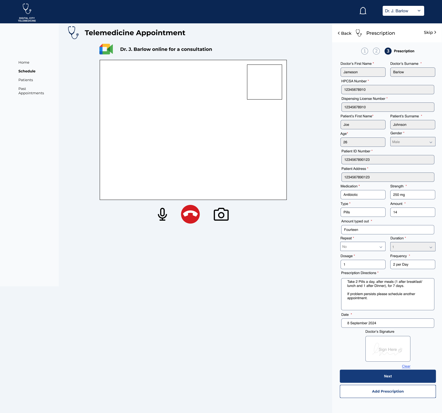
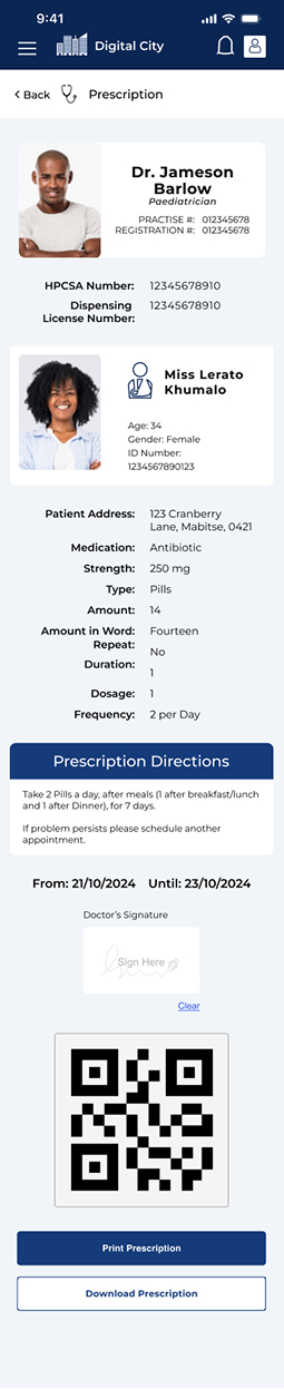
The third screen contains an in-depth prescription form that follows all the legal requirements for a prescription. Any information in grey has already been provided through the system (except for duration which requires ‘repeat’). If the ailment requires two prescriptions the professional can “Add Prescription” too.
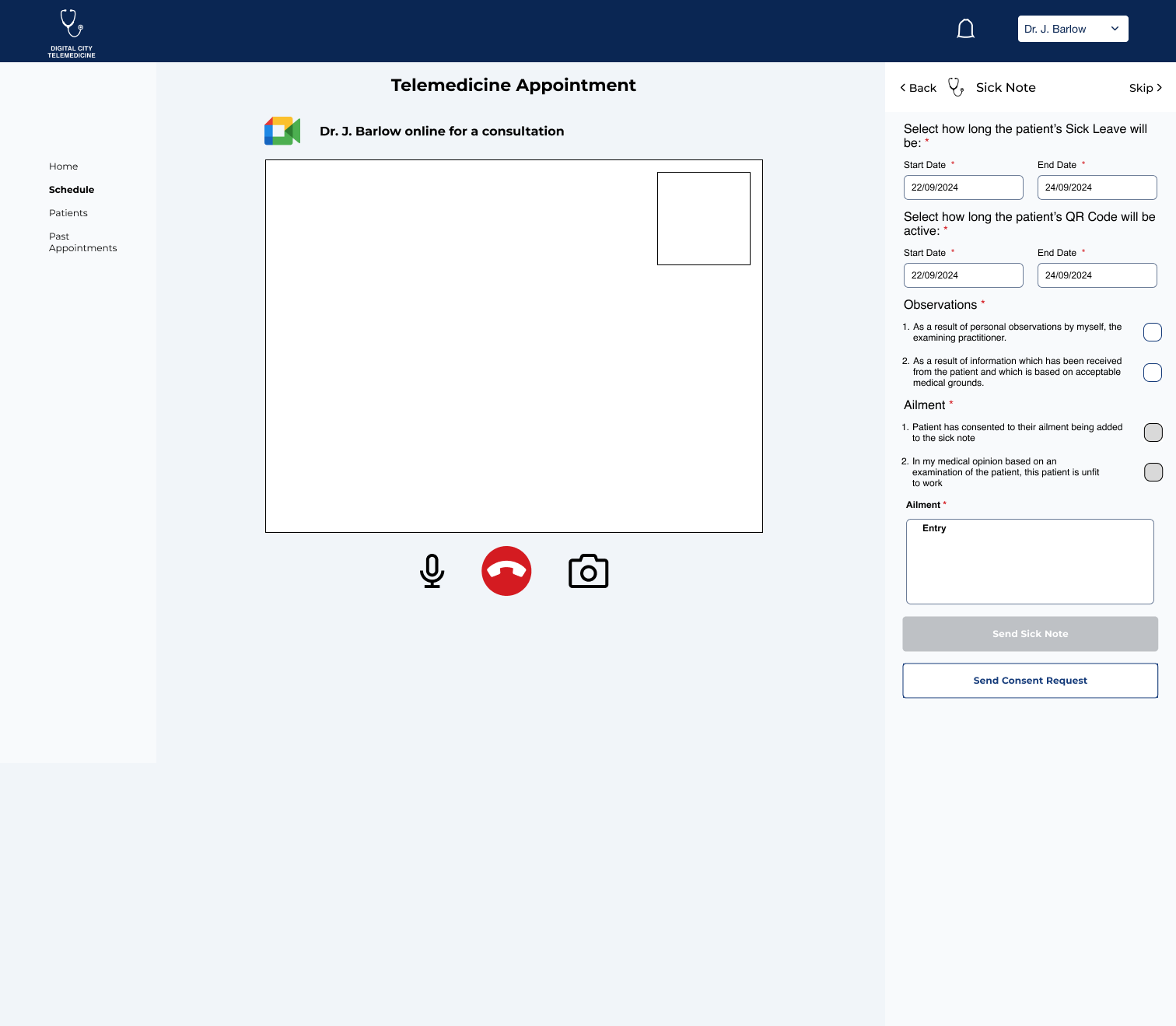
Lastly if the patient requires a legal sick note the doctor can provide one through the call.
All of this gets sent to the patient and is available to scan at the pharmacy (for prescriptions) and able to send out to relevant businesses, digital city classes, etc (with Sick Notes) since they all contain their own unique QR Code.
Scheduling
We wanted to give medical professionals the ability to set their own schedules and edit their schedules as needed. When entering their schedule page they are greeted to the upcoming appointments for the day with a brief preview on the right hand side.
Here the user can toggle through upcoming appointments by clicking dates at the top or entering the calendar. They can edit their whole schedule or just edit the availability of that day.
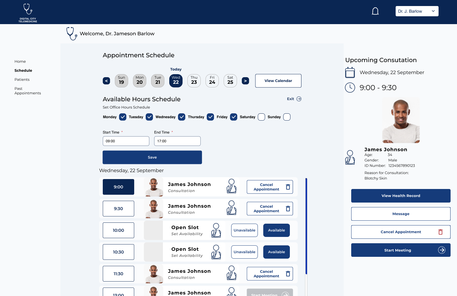
The Medical professional can set their hours and select which days they are available for appointments as well as going through their appointments and setting availability during open slots of the day.
If they need to cancel an appointment at any time these permission screens appear.
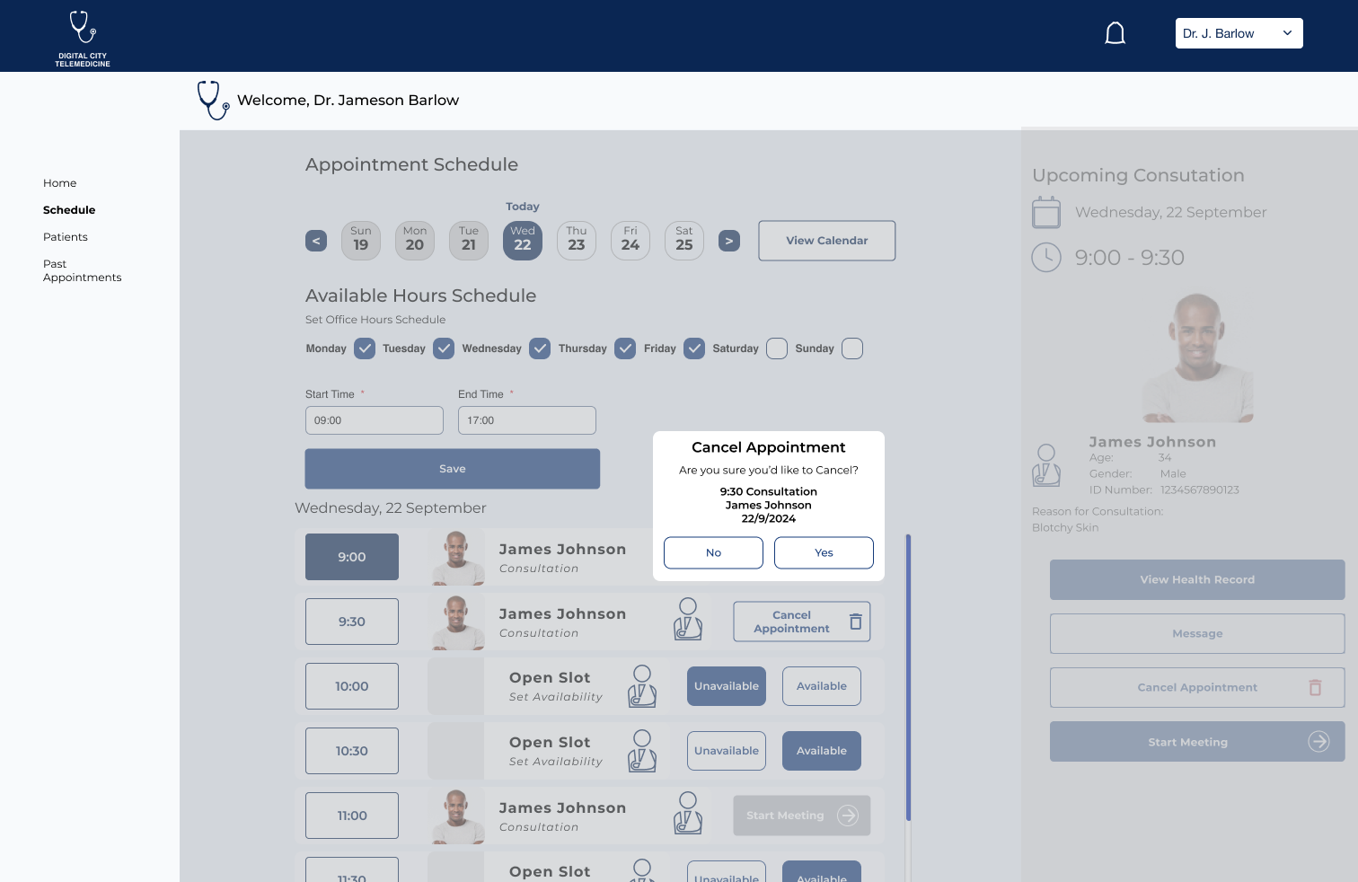
All the information is contained with-in the permissions.

The patient on the other side will get an email or whatsapp message detailing steps to create a new appointment.
Overall Conclusions
The desire was for simplicity for the core users (the patients) to schedule the healthcare checkups that they need, and on the other side for Medical Professionals to have quick easy access to all the information and forms that they may need with a simple flow. The stakeholders (senior community members) felt the flows represented those needs and provided very simple steps to achieve it.
